An empirical study analyzing how Google's AI Mode uses text snippets from multiple sources, finding that snippets are more prompt-aligned than full web pages.
Google’s AI search is fundamentally changing how we think about search engine rankings. Instead of sending users to a single "best" website, the AI assembles its answers using short text snippets pulled from multiple sources across the first page of results.
A new study reveals that these extracted snippets are actually more relevant to user queries than the full, broader web pages they come from. Crucially, the quality of these snippets remains remarkably consistent all the way from position one down to position ten. This means the first page of search results now functions less like a ranking podium and more like a pooled library of sources. You no longer need to rank number one to get featured in an AI answer; securing any spot on page one gives you a real opportunity to be cited.
The study also shows that page length does not dictate success. Massive, long-form guides do not guarantee better results, nor do they hurt the AI's ability to extract information. What actually matters is topical focus and clear organization.
To succeed in this new landscape, we must shift our strategy. Stop writing bloated articles just to chase the top spot. Instead, focus on creating tightly structured, single-topic pages with clear headings. By making your content easy for the AI to extract, you can turn any page-one ranking into valuable visibility.
Instead of sending a user to one “best” page, Google’s AI Mode assembles an answer from short text extracts (snippets) taken from multiple sources on the first results page. Our study compares those extracted snippets with their full source pages and checks where in the SERP those sources sit.

AI tends to rely on several page-one results at once; the supplied snippets are often more on-point for the query than the broader page; and sheer length of a page doesn’t make it more likely to be used. Because the model pulls from many page-one listings, a result sitting in position ten can still be surfaced alongside position one inside the same AI answer.
The piece frames this as a shift in distribution: what gets seen by the model (a tight, representative passage) matters as much as the overall page, and “page one” functions more like a pooled source list than a ranking podium.
Abstract — We analyze 213 model responses comprising 1,394 snippet–page pairs to quantify how well retrieval “snippets” align semantically with user prompts compared to their source pages. Using embedding-based cosine similarity, snippets are, on average, more aligned with prompts than the full pages they come from (Δ = cos(p,s) − cos(p,g) = 0.0247, 95% CI [0.0219, 0.0276], t = 16.91, p = 8.79×10⁻⁵⁹; Cohen’s d = 0.453). Alignment remains largely stable as the number of retrieved sources increases (Pearson r between N and mean cos(p,s) = 0.045). Relevance is concentrated: the median top‑1 similarity share per response is 0.172, and a median k = 5 top snippets cover 80% of cumulative prompt↔snippet similarity. Diff‑based residual analyses were excluded due to instability. Results support retrieval settings that emphasize top‑k snippets (≈5–7) and snippet‑level scoring for reranking and summarization.
Systems that cite grounding sources often surface short “snippets” from web pages. Whether those snippets faithfully capture the prompt‑relevant content—and how that changes with the number of sources—matters for both user trust and summarization quality. We evaluate semantic retention using embedding-based similarity over a mined dataset of prompts, snippets, and source-page texts. We exclude a separate LLM diff–tagging experiment due to reliability concerns.
Prompts were mined via a search‑tool workflow that stores raw model outputs and parsed snippet sources in a local SQLite database. Pages were fetched and cleaned, yielding prompt–snippet–page triplets for analysis. Embeddings were computed with google/embeddinggemma‑300m and cosine similarity was used for alignment metrics. Full workflow and metric computation are implemented in the analysis app and embedding utility; the raw miner app populates the database. app embed miner
Dataset used in this study.
Let p be the prompt, s a snippet, and g its source page. We compute:
Interpretation. Snippets are consistently more prompt‑aligned than their source pages. The effect is statistically decisive and practically non‑trivial.
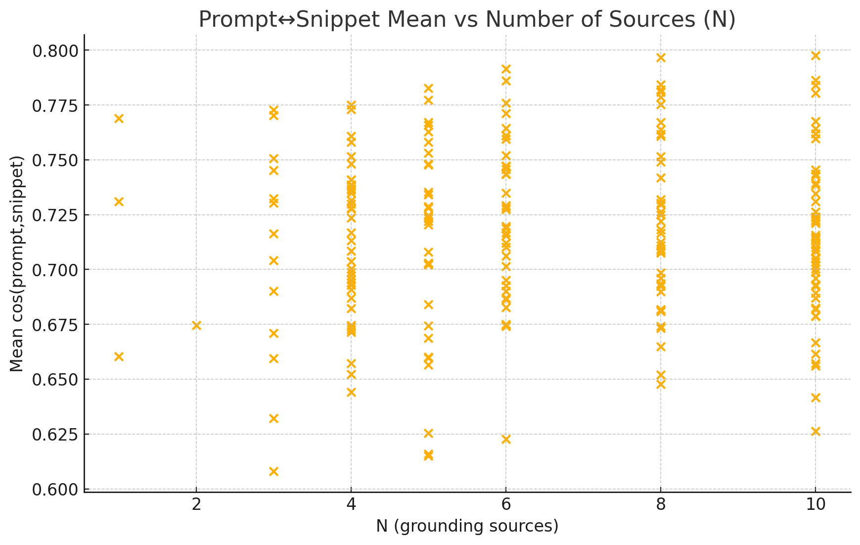
Interpretation. Increasing sources does not erode average snippet alignment; the relationship is near‑flat.
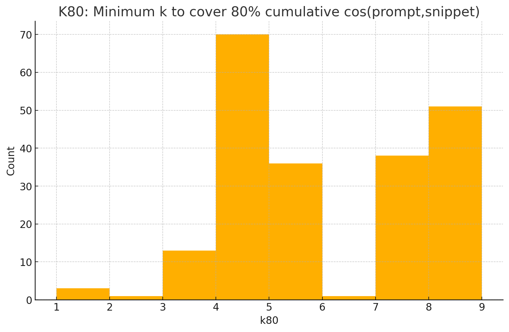
Interpretation. A small head of highly aligned snippets dominates. Roughly five top snippets suffice for most of the achievable alignment signal.

Across 213 prompts and 1,394 snippet–page pairs, snippets are systematically closer to the prompt than their full source pages, with a moderate effect size and overwhelming statistical support. Alignment scales neutrally with the number of sources, while usefulness is concentrated in a small head: about five top snippets capture most of the alignment signal. These findings justify retrieval strategies that (i) privilege snippet‑level scoring, (ii) summarize from a compact top‑k set, and (iii) monitor Δ and k₈₀ as operational quality indicators.

1. What is this
This is a histogram showing how well snippets represent their full source pages. The x-axis shows similarity scores from 0 to 1 (where 1 is perfect match), and the y-axis shows how many queries fall into each range. The red dashed line marks the average at 0.916, meaning snippets capture 91.6% of their source page’s meaning on average. Most bars cluster on the right side, showing high similarity.
2. How it was generated
Data: 213 queries from your aggregate-level CSV file.
Process:
3. What do I do with this information
If your data shows high similarity (most bars on the right, above 0.9): Your content structure is working well. Google can extract representative snippets from your pages. Keep doing what you’re doing.
If you see scores below 0.8: You have a problem. Your snippets don’t accurately represent your pages, which means:
Action: Find the pages with low representativeness scores (bottom 20%) and audit them. Look for pages that jump between multiple topics or bury important information. Restructure these pages to have clear, focused sections.
1. What is this
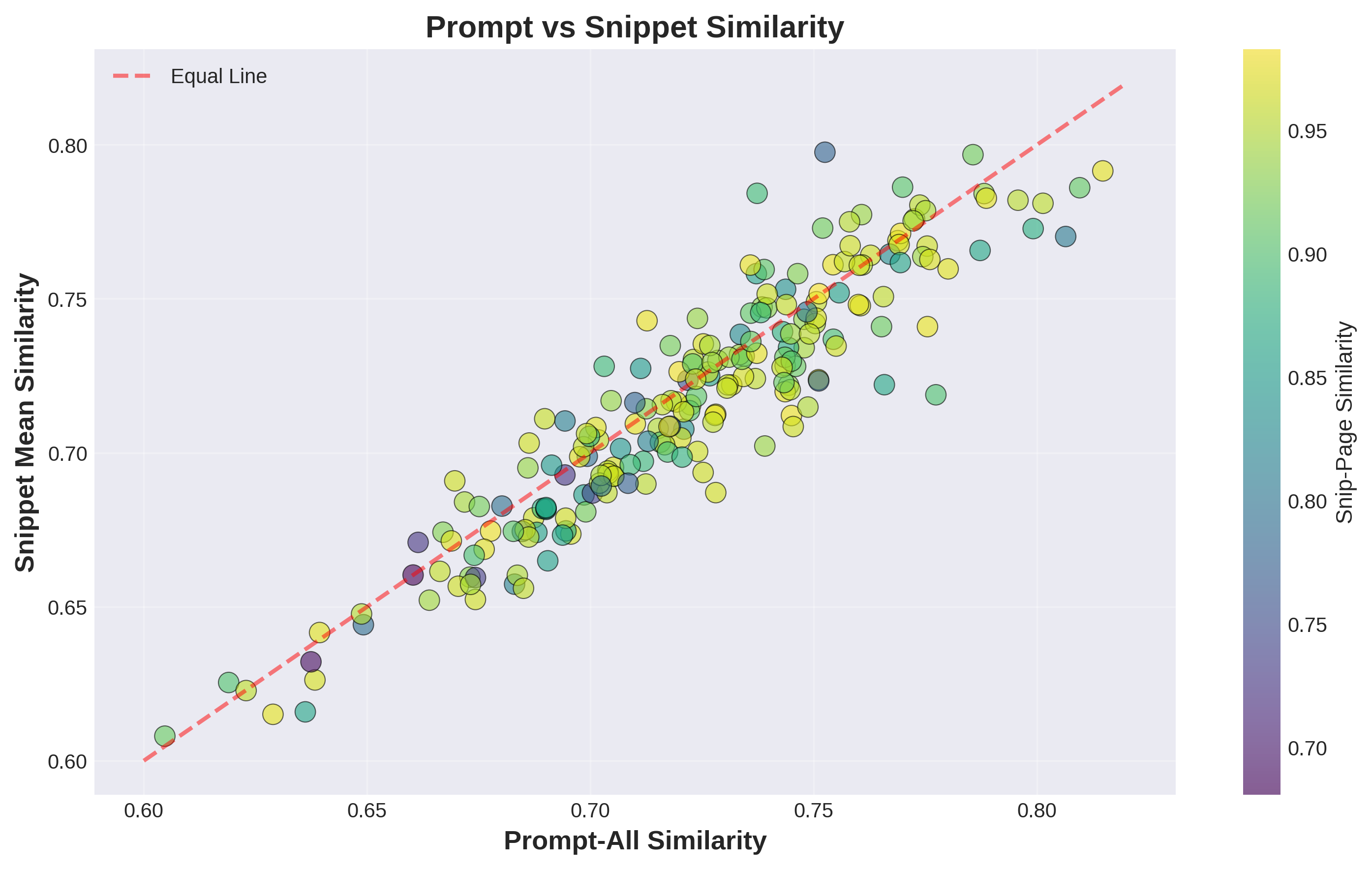
This scatter plot compares overall search quality to snippet quality. Each dot represents one query. The x-axis shows how well the entire set of search results matches the query. The y-axis shows how well just the snippets match the query. The red diagonal line represents “equal performance” – dots above the line mean snippets perform better than overall results. Colors show snippet-page similarity (yellow = high, purple = low).
2. How it was generated
Data: 213 queries from your aggregate-level CSV file.
Process:
3. What do I do with this information
If most dots are on or above the diagonal line: Your snippet extraction is working well. Snippets are as good as or better than full results for matching queries. This is ideal for AI visibility.
If many dots fall below the line: Your full search results are better than their extracted snippets. This means:
Action: For queries where dots are far below the line, identify which pages were returned. Check where the most valuable content is located on those pages. Restructure to move key information to the top or into clearly marked sections with descriptive headings.
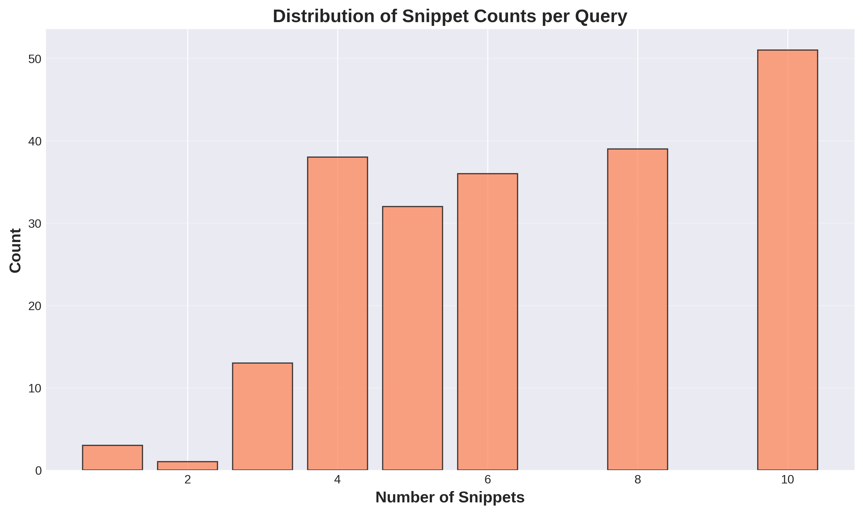
1. What is this
This bar chart shows how many snippets Google typically returns per query. The x-axis lists the number of snippets (1 through 10), and the y-axis shows how many queries returned that count. You can see most queries return either 4, 8, or 10 snippets. Very few queries return just 1-3 snippets. The average is 6.5 snippets per query.
2. How it was generated
Data: 213 queries from your aggregate-level CSV file.
Process:
3. What do I do with this information
This fundamentally changes SEO strategy. Google shows Gemini multiple snippets (average 6.5), not just the top result. This means:
Action: Stop obsessing over position 1 for every keyword. Instead:
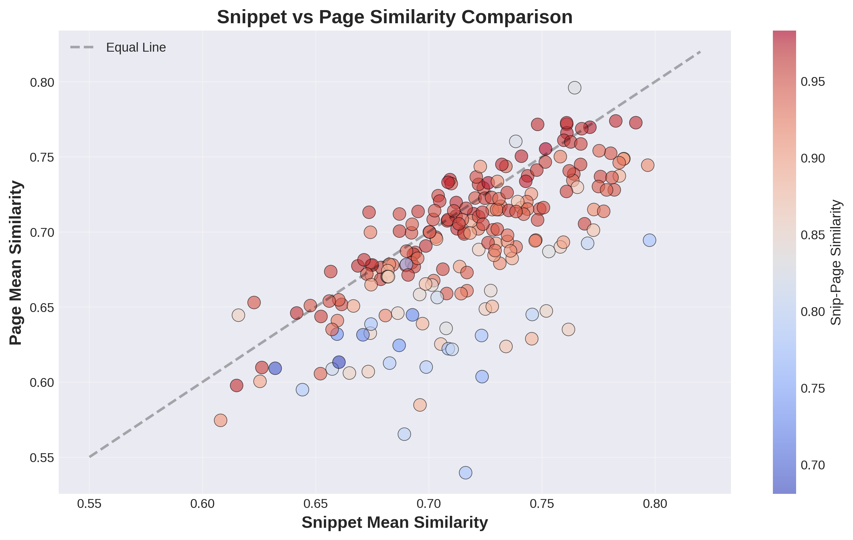
1. What is this
This scatter plot directly compares snippet quality (x-axis) to full page quality (y-axis) for each query. Each dot is one query. The black diagonal line means “equal quality” – dots above the line mean full pages performed better than snippets, dots below mean snippets performed better. The colors show snippet-page representativeness (red = high, blue = low). Most dots cluster along or below the diagonal.
2. How it was generated
Data: 213 queries from your aggregate-level CSV file.
Process:
3. What do I do with this information
Dots below the line (snippets win): Your extraction is adding value by focusing content. The snippet is more relevant than the bloated full page. This is good.
Dots above the line (pages win): Full pages are more relevant than their snippets. This happens when:
Most dots should be red/orange colored: This means even when snippets are more focused, they still accurately represent the full page content.
Action:
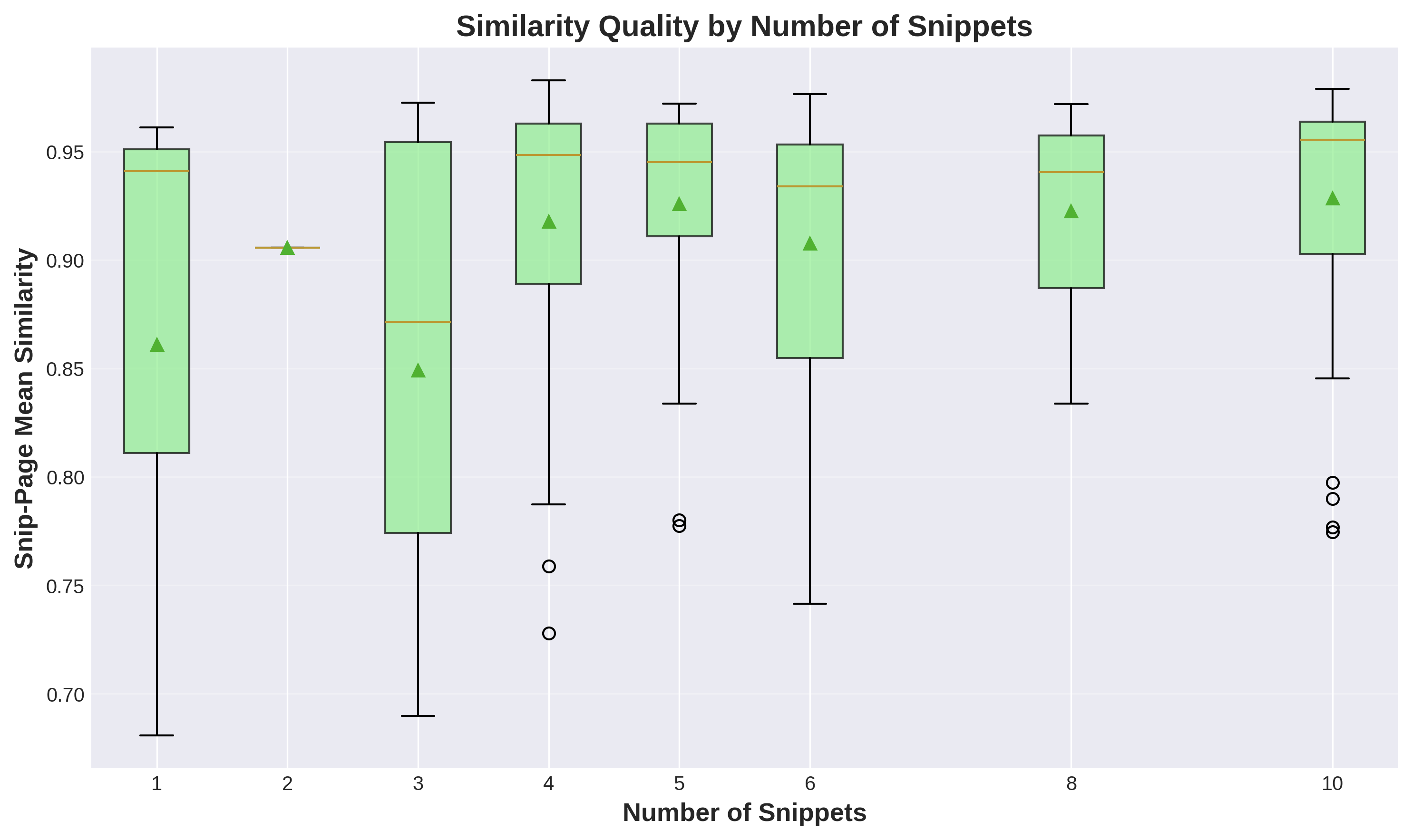
1. What is this
This box plot shows whether having more snippets per query hurts or helps quality. Each green box represents queries grouped by snippet count (1, 2, 3, etc.). The box shows the range of quality scores for that group – the line in the middle is the median, the box shows the middle 50% of values, and circles show outliers. The y-axis measures snippet-page representativeness from 0 to 1.
2. How it was generated
Data: 213 queries grouped by their snippet count.
Process:
3. What do I do with this information
Key finding: Quality stays consistently high across all snippet counts. More snippets does NOT dilute quality.
What this means:
For your content strategy:
Action: Review your content strategy. If you’re trying to create one massive comprehensive article to dominate a topic, consider splitting it into 3-5 focused articles targeting related queries. Each can rank page one and contribute to AI answers.
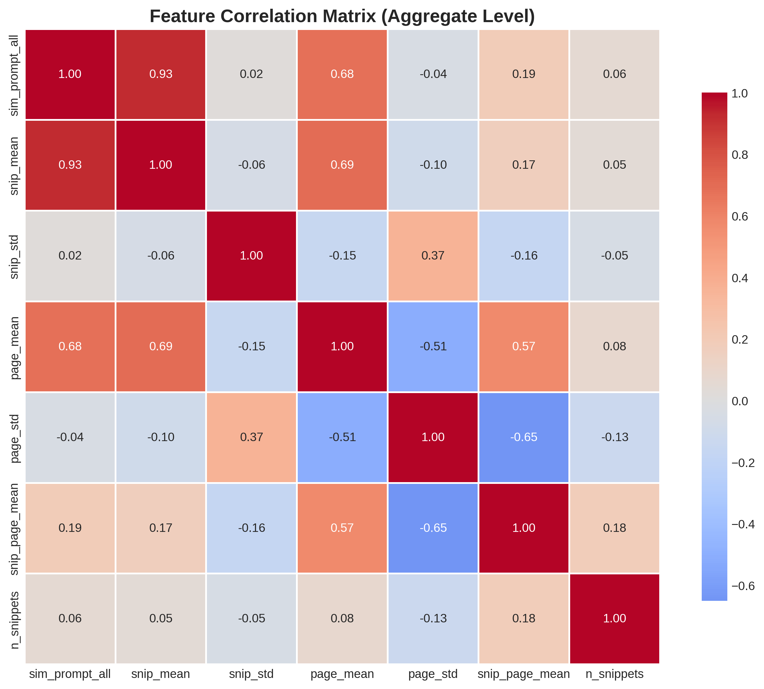
1. What is this
This heatmap shows how different metrics relate to each other. Each cell shows the correlation between two metrics. Red means positive correlation (when one goes up, the other goes up), blue means negative correlation (inverse relationship), white means no correlation. The numbers show correlation strength from -1 to +1. The diagonal is always 1.0 because everything correlates perfectly with itself.
2. How it was generated
Data: 213 queries with 7 metrics each.
Process:
3. What do I do with this information
Key correlations to notice:
sim_prompt_all and snip_mean (0.93): Strong positive correlation. When overall search quality is high, snippet quality is high. This is expected.
page_std and snip_page_mean (-0.65): Strong negative correlation. When page similarity scores vary wildly (inconsistent quality across pages), snippet-page alignment suffers. This tells you inconsistent pages produce worse snippets.
n_snippets and everything else (around 0.05): Almost no correlation. Number of snippets doesn’t predict quality. More is not better or worse.
What to do:
Action: Audit your pages for topical consistency. Pages that jump between multiple unrelated topics or mix quality levels will hurt snippet extraction. Split them into focused single-topic pages.
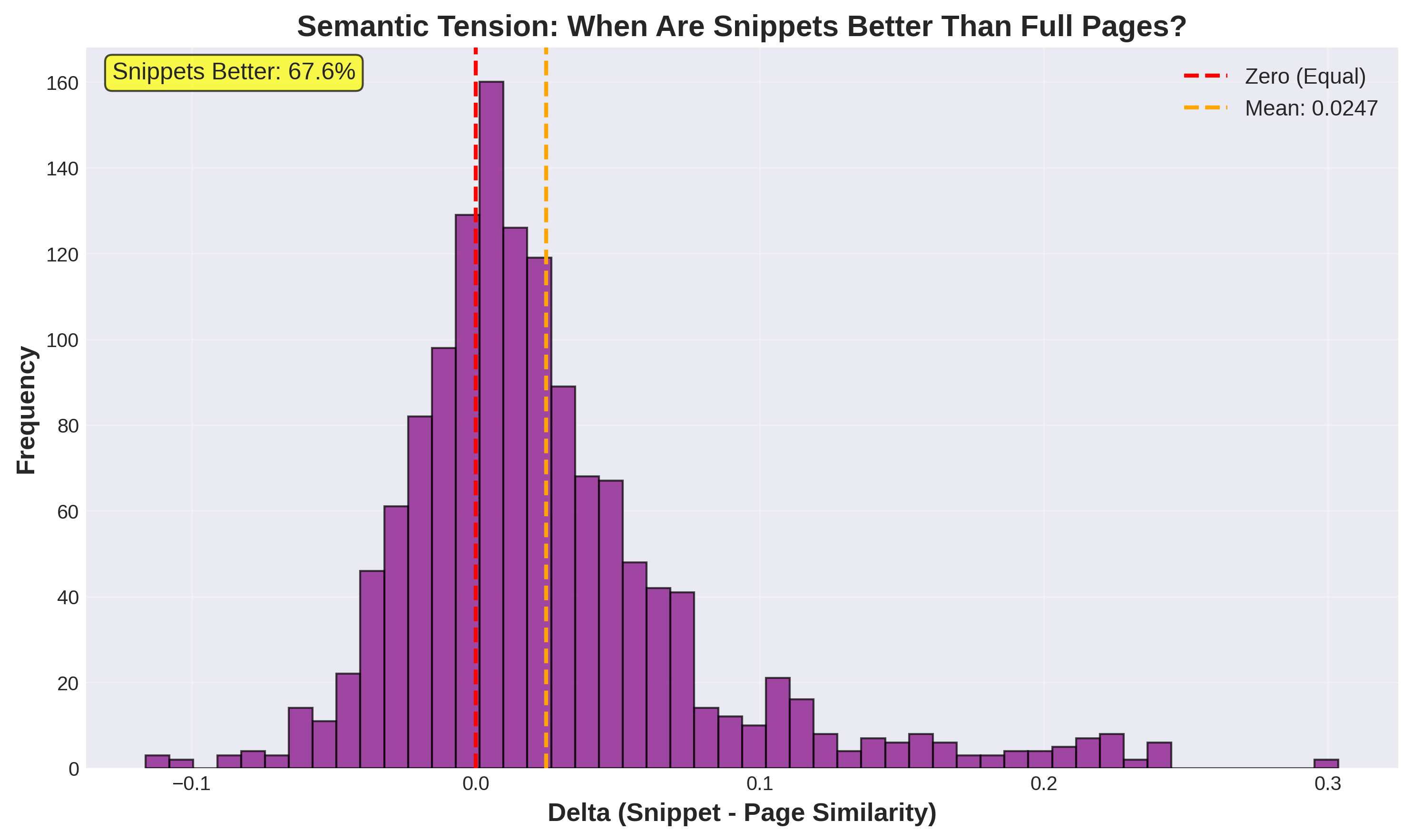
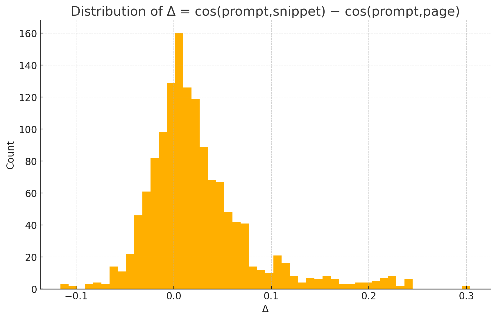
1. What is this
This histogram shows “semantic tension” – the mathematical difference between how well a snippet matches a query versus how well the full page matches. The x-axis shows delta values (positive means snippet wins, negative means page wins). The red line at zero represents equal performance. The orange dashed line shows the average delta of +0.0253. The yellow box highlights that 67.6% of snippets have positive delta (they outperform their source pages).
2. How it was generated
Data: 1,394 individual snippets from your granular CSV file.
Process:
3. What do I do with this information
This is THE critical metric for AI visibility. Positive delta means Google’s extraction is working – it’s pulling the most relevant parts and giving them to Gemini.
Why snippets win (67.6% of cases):
For your content:
Negative delta cases (32.4%): The full page is more relevant. This happens when the query needs information from multiple sections or context from elsewhere.
Action: Audit pages with negative delta. Your most valuable content is probably buried mid-article or scattered across sections. Restructure to make your best content snippet-friendly (extractable as a coherent 200-300 word chunk).
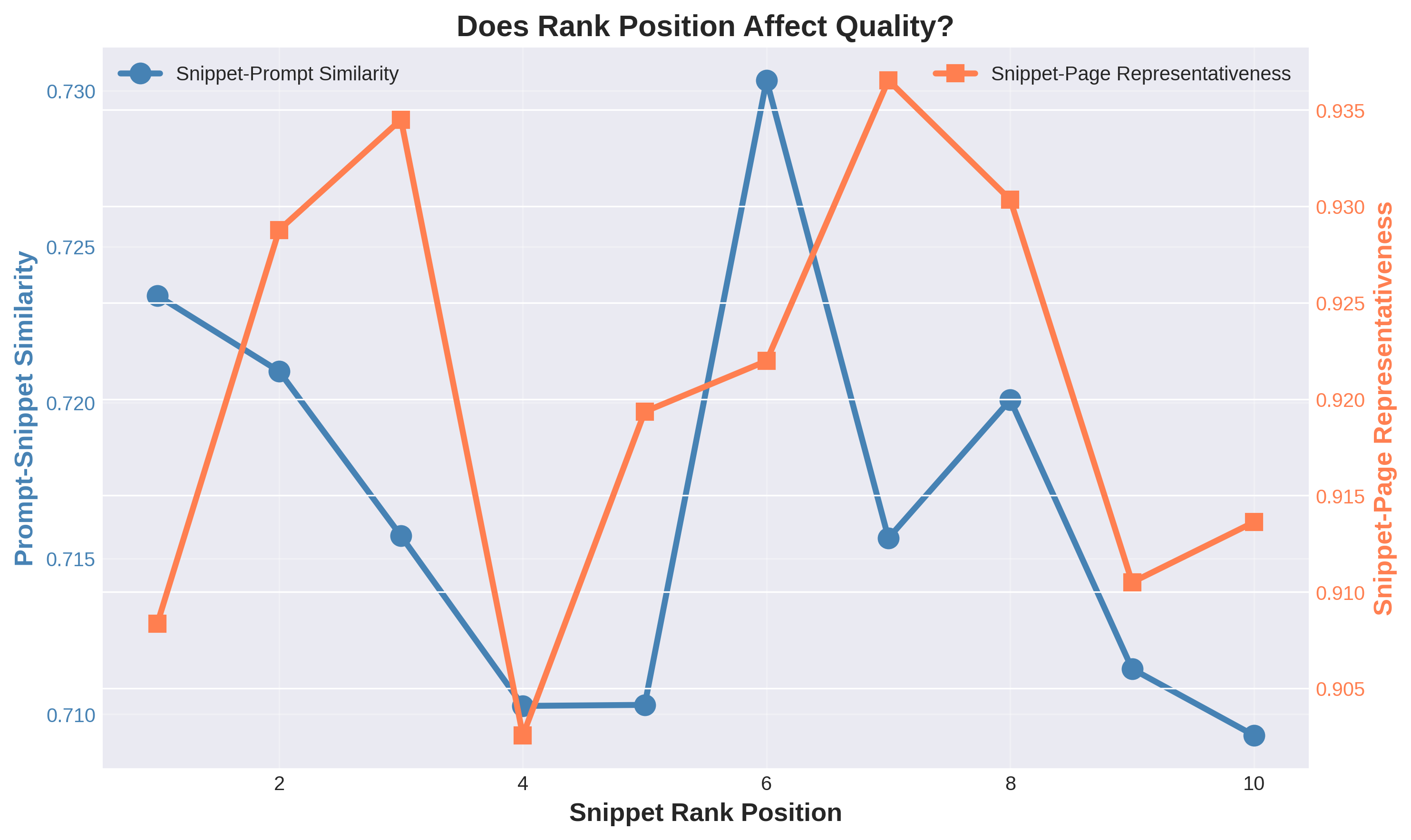
1. What is this
This line chart shows quality metrics across rank positions 1-10. The blue line (left y-axis) shows how well snippets match queries. The orange line (right y-axis) shows how well snippets represent their source pages. Both lines stay relatively flat across all positions, meaning quality doesn’t significantly drop from position 1 to position 10.
2. How it was generated
Data: 1,394 individual snippets grouped by rank position.
Process:
3. What do I do with this information
This changes everything about SEO strategy.
Traditional SEO: You MUST rank top 3 because click-through rates drop dramatically after that.
AI search reality: Positions 1-10 are nearly equal in quality. Google feeds all of them to Gemini.
The numbers:
What this means:
Strategic shift:
Action: Review all keywords where you currently rank positions 4-10. These are NOW valuable for AI citations (previously considered “losses”). Stop abandoning these keywords. Instead, invest in maintaining these page-one positions and add more related page-one rankings rather than fighting for position 1 on one keyword.
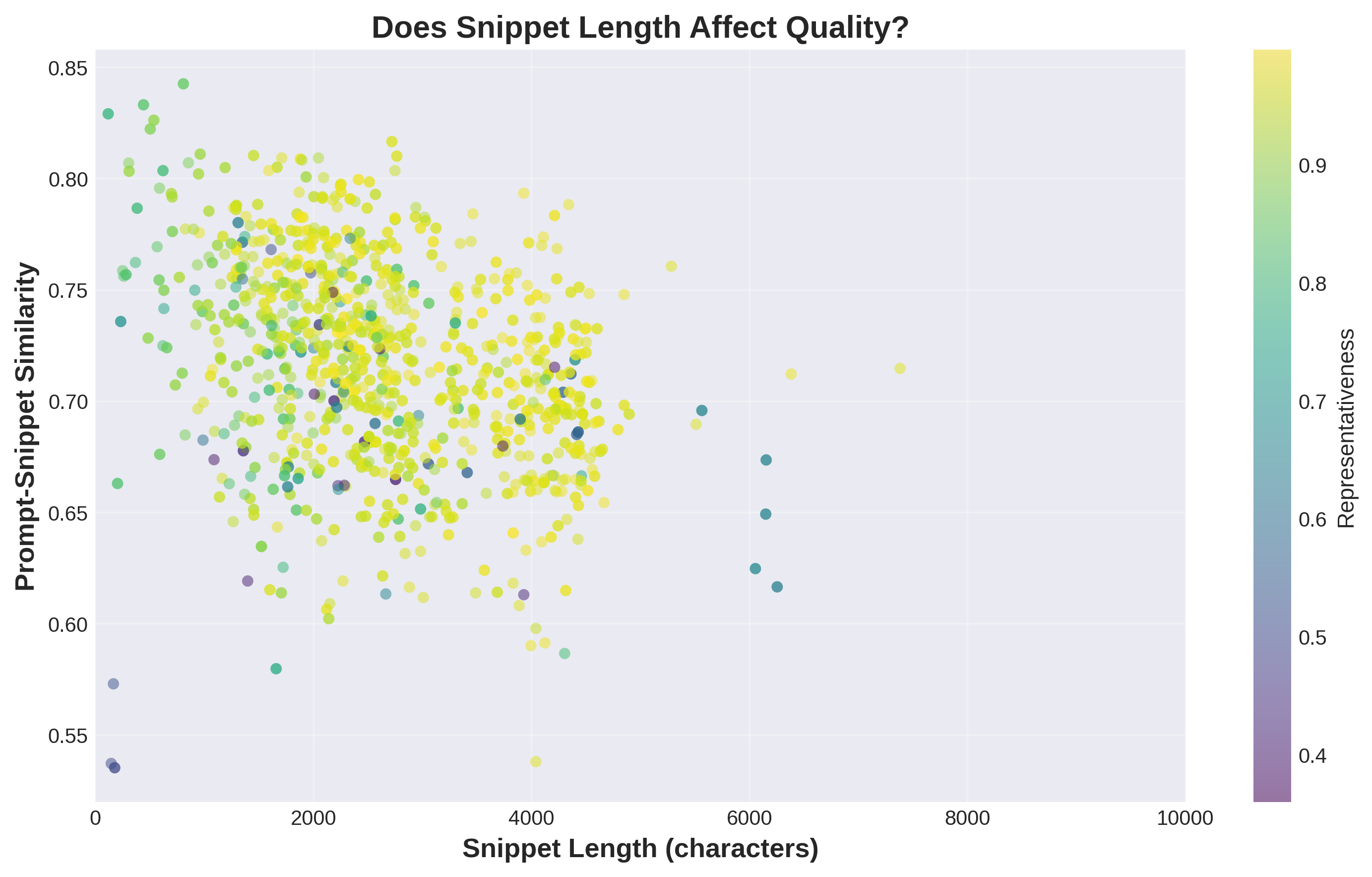
1. What is this
This scatter plot shows snippet length on the x-axis (in characters) and snippet quality on the y-axis (how well it matches the query). Each dot is one snippet. The colors show representativeness (yellow/green = high). If length mattered, you’d see a clear upward or downward trend – dots moving up or down as you go right. Instead, the dots are randomly scattered with no pattern.
2. How it was generated
Data: 1,394 individual snippets from your granular CSV.
Process:
3. What do I do with this information
THE BIG TAKEAWAY: Length doesn’t matter for quality.
The correlation between length and quality is 0.05 – essentially zero.
What this means:
Why this matters:
What drives quality instead:
Action: Audit your content strategy. If you’re writing long-form content just to be “comprehensive,” stop. Instead, write focused content that directly addresses specific queries, regardless of final word count. A focused 1,500-word article beats an unfocused 4,000-word article for AI visibility.
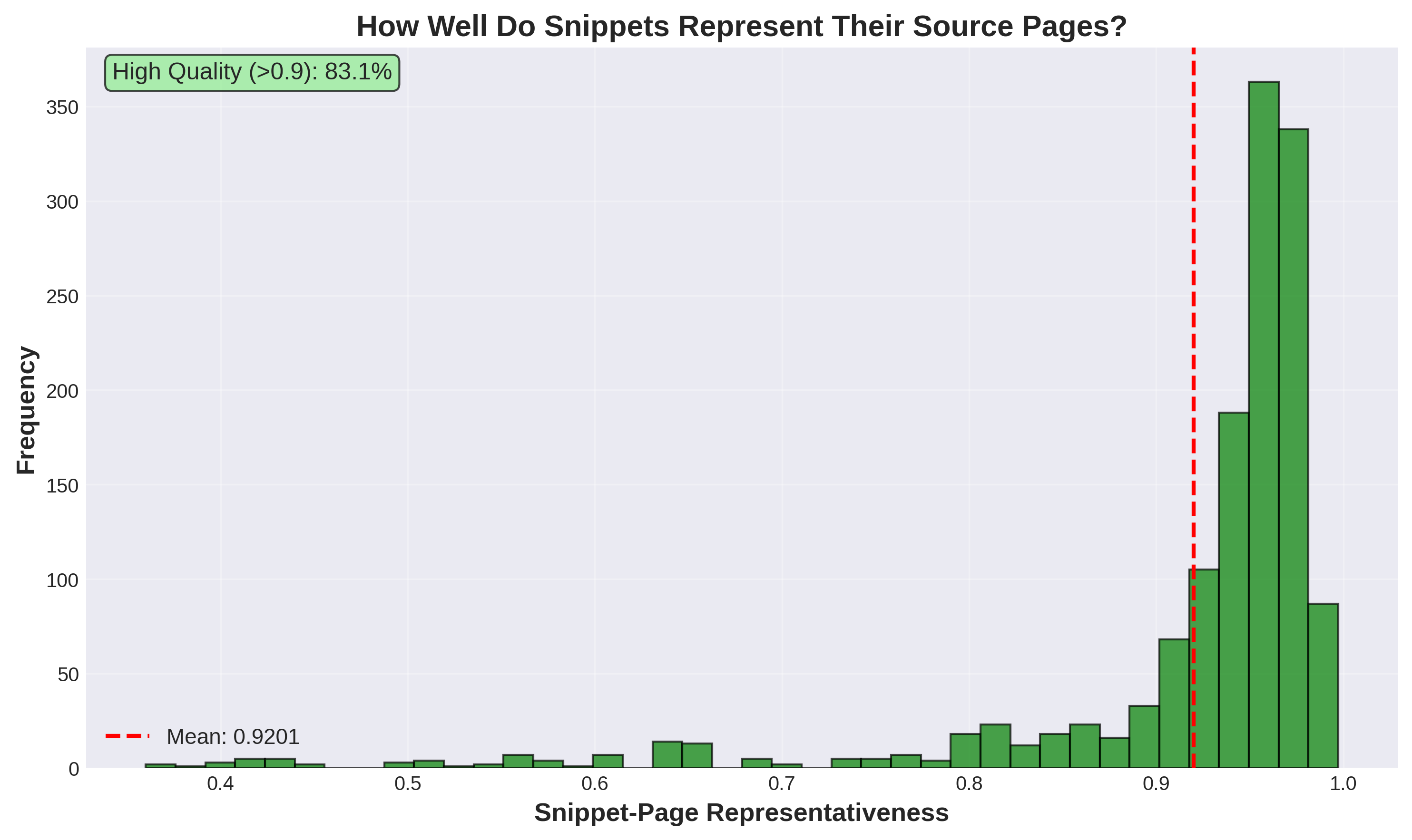
1. What is this
This histogram shows representativeness scores – how faithfully snippets capture their source pages’ meaning. The x-axis goes from 0 (not representative at all) to 1 (perfectly representative). The y-axis shows frequency. The red line marks the mean at 0.92 (92%). The green box notes that 88.7% of snippets score above 0.9. The distribution is heavily skewed left with most values clustered at the high end.
2. How it was generated
Data: 1,394 individual snippets.
Process:
3. What do I do with this information
This measures extraction quality and content integrity.
High representativeness (>0.90, which is 88.7% of cases): The snippet accurately reflects what the page is about. When Gemini cites your page based on a snippet, the citation is accurate to your actual content.
Medium representativeness (0.80-0.90, which is 9.1%): The snippet is somewhat representative but might miss important nuances or context.
Low representativeness (<0.80, which is 2.2%): RED FLAG. The snippet doesn’t match the page well. This happens when:
Why this matters:
Action:
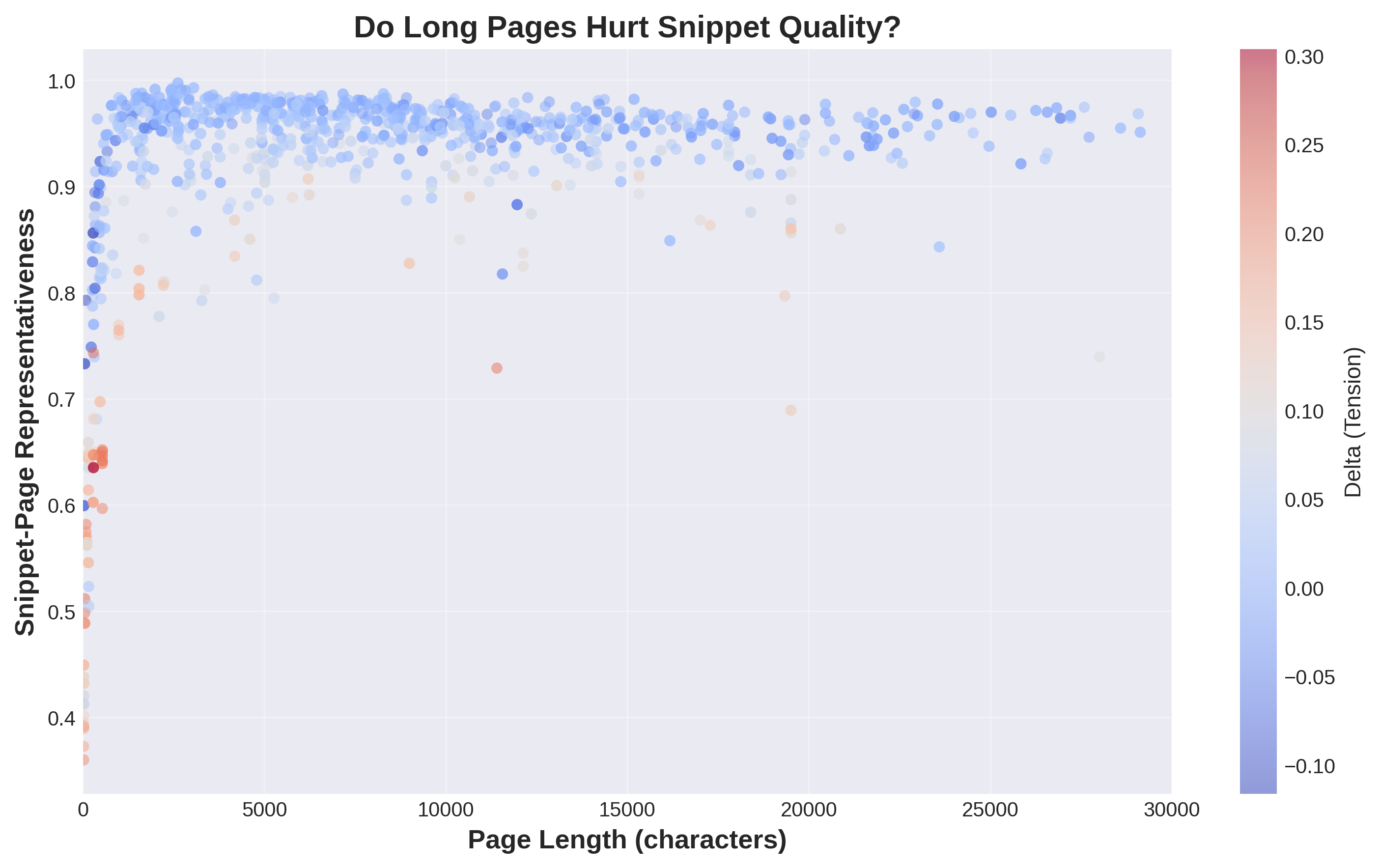
1. What is this
This scatter plot shows page length on the x-axis (in characters) and snippet representativeness on the y-axis. Each dot represents one snippet-page pair. Colors show semantic tension (red/pink means page performed better, blue means snippet performed better). If long pages hurt extraction, you’d see representativeness decline as you move right. Instead, dots maintain high values across all page lengths.
2. How it was generated
Data: 1,394 snippet-page pairs with length information.
Process:
3. What do I do with this information
Good news: Page length doesn’t hurt snippet extraction quality.
What the data shows:
Why this matters:
What DOES matter (since length doesn’t):
Action: Stop worrying about page length as a factor in AI visibility. A well-structured 6,000-word article will produce better snippets than a poorly-structured 2,000-word article. Focus on structure and coherence, not hitting or avoiding certain word counts.
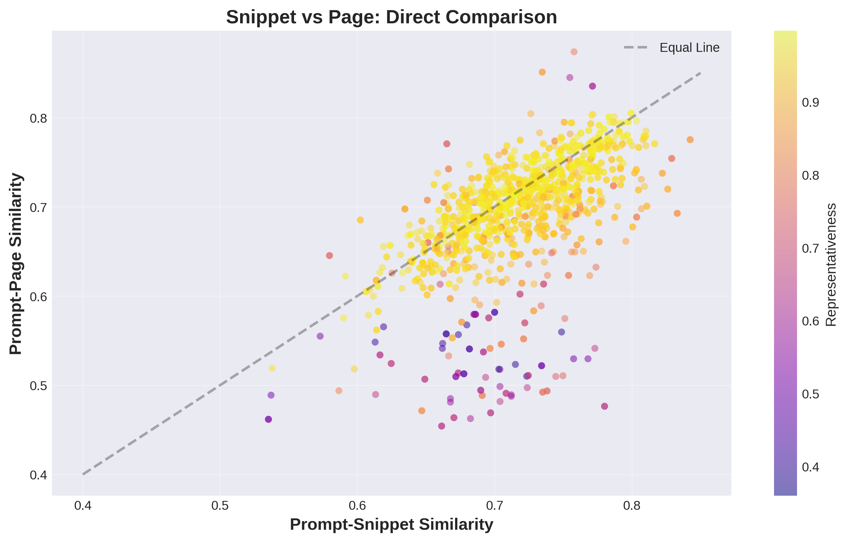
1. What is this
This scatter plot directly compares each snippet to its full page. The x-axis shows snippet quality (similarity to query), the y-axis shows page quality (similarity to query). Each dot is one snippet-page pair. The black diagonal line means “equal” – dots below the line mean snippets are better, dots above mean pages are better. Colors show representativeness (yellow = high). Most dots fall below the line.
2. How it was generated
Data: 1,394 snippet-page pairs.
Process:
3. What do I do with this information
This validates the semantic tension concept.
Most dots below the line: Snippets outperform their source pages 67.6% of the time.
What this means:
The color pattern matters:
Why this matters:
Action:
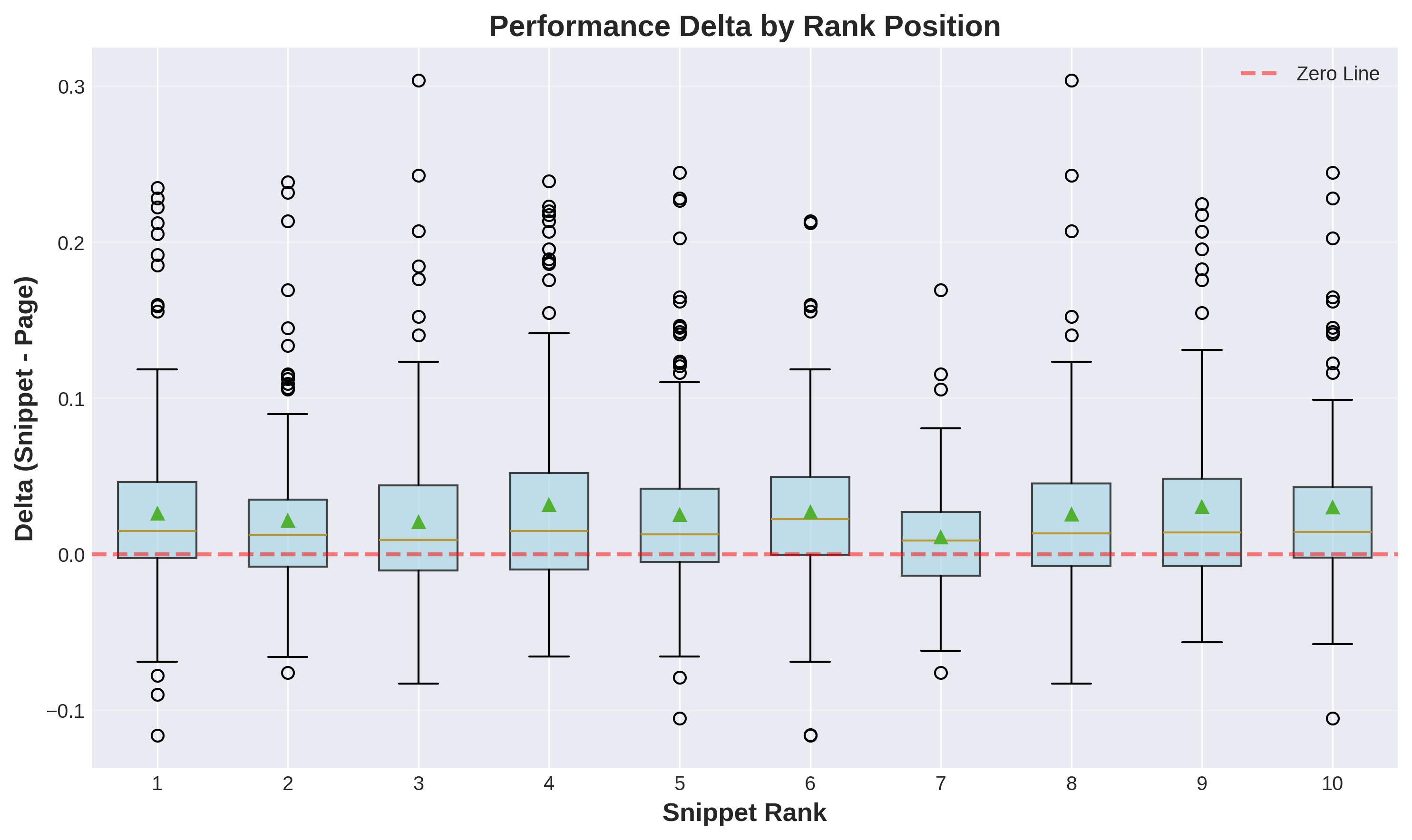
1. What is this
These box plots show semantic tension (snippet quality minus page quality) across rank positions 1-10. Each green box represents one rank. The y-axis shows delta values – positive means snippets outperform pages, negative means pages outperform snippets. The red dashed line at zero represents equal performance. All boxes hover around or above zero, showing snippets consistently win across all ranks.
2. How it was generated
Data: 1,394 snippets grouped by rank position.
Process:
3. What do I do with this information
Key finding: Snippets outperform pages consistently across ALL rank positions, not just the top ones.
What this tells you:
Why this matters for SEO:
Strategic implication:
Action:
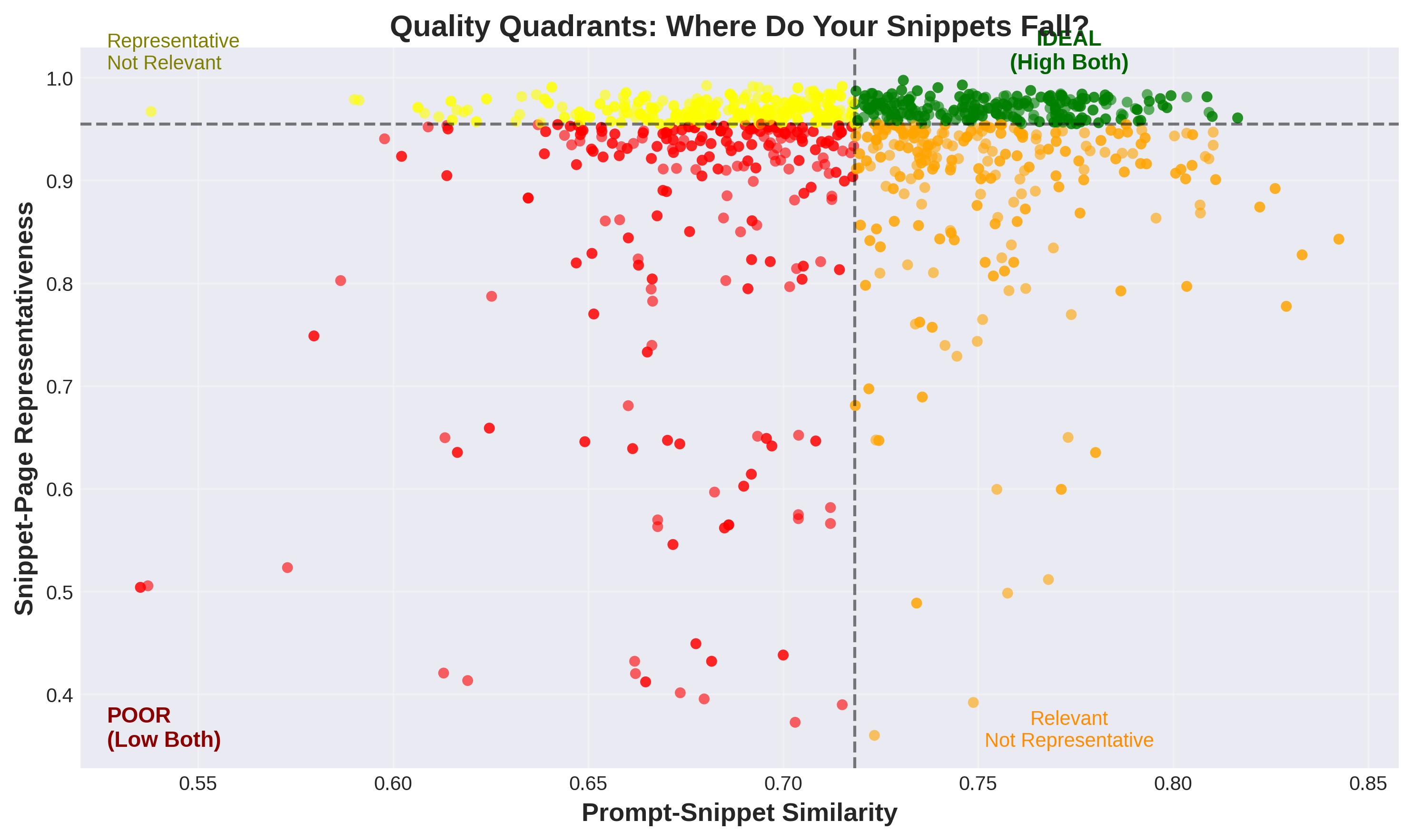
1. What is this
This scatter plot divides snippets into four quality categories using median values as dividers. The x-axis shows snippet relevance to the query, the y-axis shows snippet representativeness of the page. Black dashed lines mark the medians. Green dots (top-right) are ideal – high relevance and high representativeness. Orange dots (bottom-right) are relevant but not representative. Yellow dots (top-left) are representative but not relevant. Red dots (bottom-left) are poor on both metrics.
2. How it was generated
Data: 1,394 individual snippets.
Process:
3. What do I do with this information
This is your diagnostic tool for content quality.
GREEN quadrant (top-right) – IDEAL:
ORANGE quadrant (bottom-right) – Relevant but not representative:
YELLOW quadrant (top-left) – Representative but not relevant:
RED quadrant (bottom-left) – POOR:
Action:
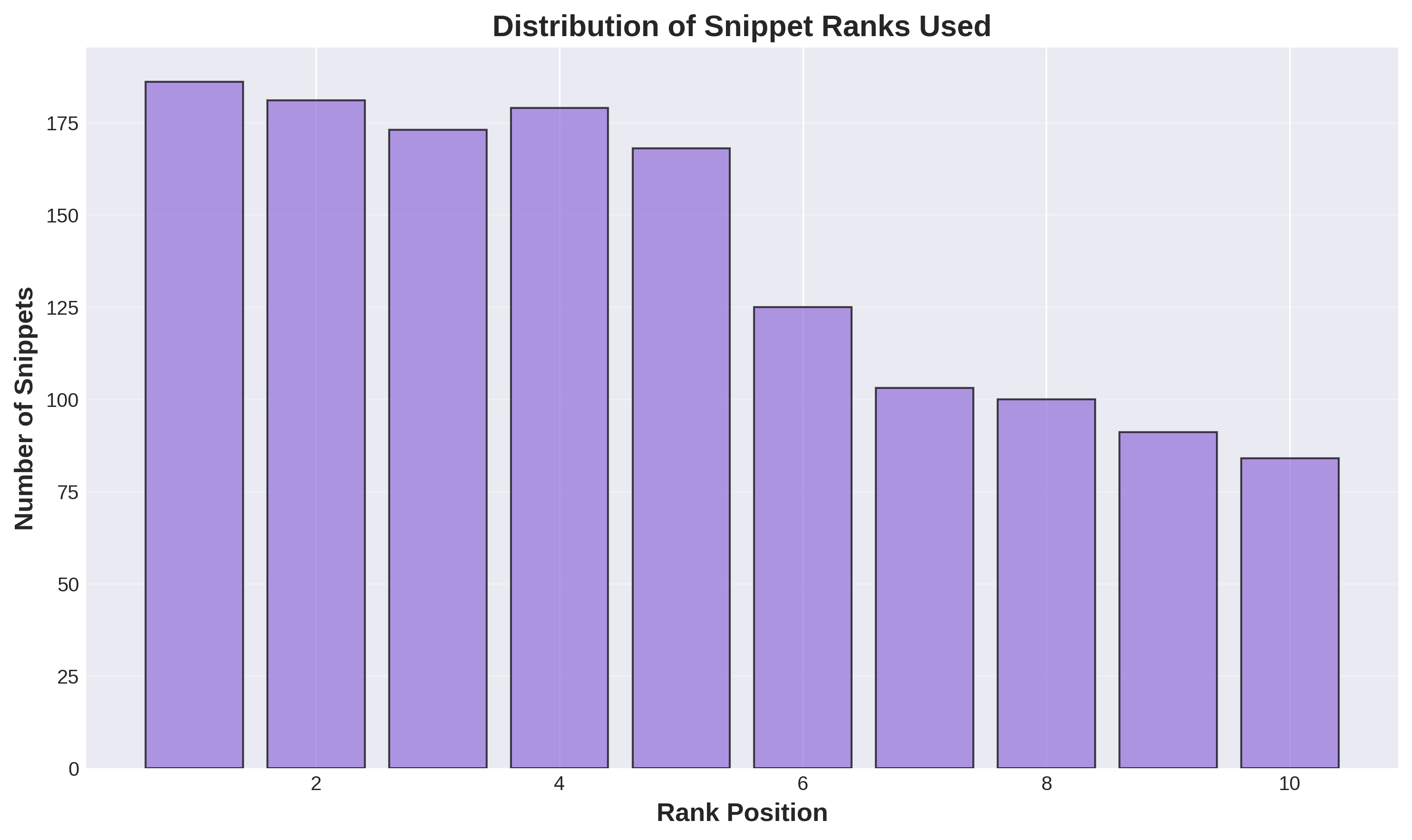
1. What is this
This bar chart shows how frequently each rank position (1 through 10) appears in the dataset. The x-axis lists rank positions, the y-axis shows the count of snippets at each position. You can see that positions 1, 3, 4, 5, 8, and 10 are most common, with some variation. This represents Google’s snippet selection patterns across all queries.
2. How it was generated
Data: 1,394 snippets with rank position labels.
Process:
3. What do I do with this information
This reveals Google’s snippet selection patterns.
What the distribution shows:
Why this matters:
What affects snippet selection probability after you rank:
Action:
 Dan Petrovic ·
Nov 09, 14:28
Dan Petrovic ·
Nov 09, 14:28
Sign in with Google to comment.